Copy to clipboard
DefaultTealDark tealYellowRed
<div class="flex flex-wrap gap-2">
  <Badge>Default</Badge>
  <Badge variant="teal">Teal</Badge>
  <Badge variant="dark-teal">Dark teal</Badge>
  <Badge variant="yellow">Yellow</Badge>
  <Badge variant="red">Red</Badge>
</div>
<div class="flex flex-wrap gap-2">
<Badge>Default</Badge>
<Badge variant="teal">Teal</Badge>
<Badge variant="dark-teal">Dark teal</Badge>
<Badge variant="yellow">Yellow</Badge>
<Badge variant="red">Red</Badge>
</div><div class="flex flex-wrap gap-2">
<Badge>Default</Badge>
<Badge variant="teal">Teal</Badge>
<Badge variant="dark-teal">Dark teal</Badge>
<Badge variant="yellow">Yellow</Badge>
<Badge variant="red">Red</Badge>
</div>
Installation
Copy to clipboard
npx @vds-testing/cli add badge
npx @vds-testing/cli add badgenpx @vds-testing/cli add badge
bunx @vds-testing/cli add badge
bunx @vds-testing/cli add badgebunx @vds-testing/cli add badge
pnpm dlx @vds-testing/cli add badge
pnpm dlx @vds-testing/cli add badgepnpm dlx @vds-testing/cli add badge
yarn dlx @vds-testing/cli add badge
yarn dlx @vds-testing/cli add badgeyarn dlx @vds-testing/cli add badge
pnpm install @vds-testing/react @vds-testing/stylespnpm install @vds-testing/elements @vds-testing/stylesPackages are consumed via the workspace locally and are not published yet. See Installation for CSS setup.
Usage
Astro:
import { Badge } from "@/components/vds/badge"<Badge variant="teal">New</Badge>React:
import { Badge } from "@vds-testing/react"<Badge variant="teal">New</Badge>Web Components:
<script type="module">
  import "@vds-testing/elements";
</script>
<vds-badge variant="teal">New</vds-badge>
Examples
Text case
Labels are all caps by default. Set textCase="title" to capitalise the first letter of each word instead.
Copy to clipboard
New todaynew today
<div class="flex flex-wrap gap-2">
  <Badge variant="teal">New today</Badge>
  <Badge variant="teal" textCase="title">new today</Badge>
</div>
<div class="flex flex-wrap gap-2">
<Badge variant="teal">New today</Badge>
<Badge variant="teal" textCase="title">new today</Badge>
</div><div class="flex flex-wrap gap-2">
<Badge variant="teal">New today</Badge>
<Badge variant="teal" textCase="title">new today</Badge>
</div>
In a card
Use CardBadge to overlay a badge on the card image. It sits top-right by default. Set position="bottom-left" to align it with the title instead. See Card for both positions.
Copy to clipboard
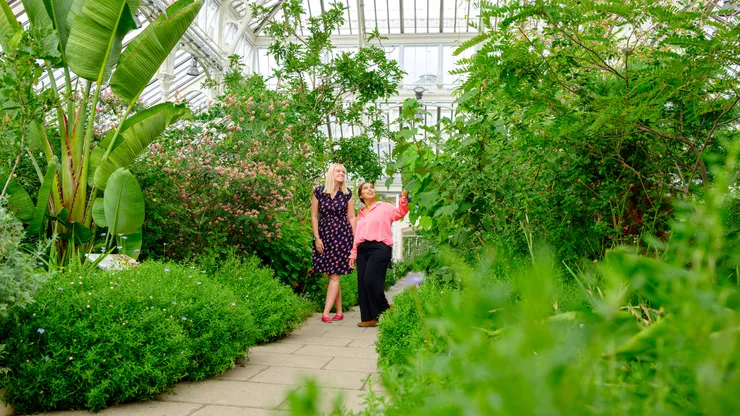
<Card>
  <Image
    src="/images/cards/vale-108-jh.webp"
    alt="Two visitors admiring the plants along a path inside a Vale glasshouse"
    variant="card"
  />
  <CardBadge variant="teal">New</CardBadge>
  <CardContent>
    <CardTitle href="#">Best things to do at Vale this spring</CardTitle>
    <CardDescription>The dinosaur tree that's still with us</CardDescription>
    <CardFooter href="#">Read more</CardFooter>
  </CardContent>
</Card>
<Card>
<Image
src="/images/cards/vale-108-jh.webp"
alt="Two visitors admiring the plants along a path inside a Vale glasshouse"
variant="card"
/>
<CardBadge variant="teal">New</CardBadge>
<CardContent>
<CardTitle href="#">Best things to do at Vale this spring</CardTitle>
<CardDescription>The dinosaur tree that's still with us</CardDescription>
<CardFooter href="#">Read more</CardFooter>
</CardContent>
</Card><Card>
<Image
src="/images/cards/vale-108-jh.webp"
alt="Two visitors admiring the plants along a path inside a Vale glasshouse"
variant="card"
/>
<CardBadge variant="teal">New</CardBadge>
<CardContent>
<CardTitle href="#">Best things to do at Vale this spring</CardTitle>
<CardDescription>The dinosaur tree that's still with us</CardDescription>
<CardFooter href="#">Read more</CardFooter>
</CardContent>
</Card>
Variants
| Variant | Background token | Label |
|---|---|---|
| default | Peach --color-peach |
Black |
| teal | Teal --color-brand (teal-500) |
White |
| yellow | Yellow --color-yellow |
Black |
| dark-teal | Dark teal --color-teal-700 |
White |
| red | Red --color-destructive |
White |
All variants are solid fills with no border or outline.
Anatomy
Badge/vds-badgerenders one inline<span>, so it is valid inside paragraphs, headings, links and card content
Props
Badge
| Prop | Type | Default | Description |
|---|---|---|---|
| variant | “default” | “teal” | “dark-teal” | “yellow” | “red” | “default” | Background colour |
| textCase | “upper” | “title” | “upper” | Label casing |
| class / className | string | - | Additional CSS classes |
Web Components use the variant and text-case attributes on vds-badge.