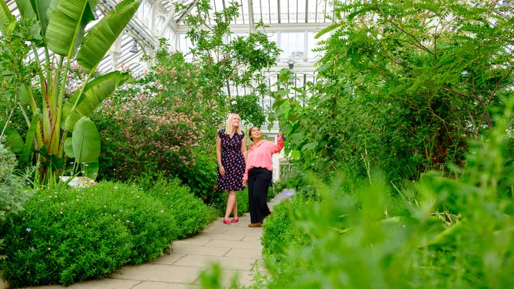
Installation
npx @vds-testing/cli add imagenpx @vds-testing/cli add image
npx @vds-testing/cli add image
bunx @vds-testing/cli add imagebunx @vds-testing/cli add image
bunx @vds-testing/cli add image
pnpm dlx @vds-testing/cli add imagepnpm dlx @vds-testing/cli add image
pnpm dlx @vds-testing/cli add image
yarn dlx @vds-testing/cli add imageyarn dlx @vds-testing/cli add image
yarn dlx @vds-testing/cli add image
Usage
import { Image } from "@/components/vds/image"
<Image src="/images/cards/vale-108-jh.webp" alt="Describe the image" variant="card" />
The image fills the width of its container and keeps the variant’s aspect ratio, cropping with object-fit: cover so it is never stretched. Spacing and layout belong to the parent component (for example Card).
Variants
| Variant |
Aspect ratio |
Display size |
Source asset |
| card |
370:208 (≈16:9) |
370 × 208px |
740 × 416px WebP, quality 80 |
Use the ratio prop to override a variant’s aspect ratio, for example ratio="4/3" or ratio="1/1". The image still fills its container width and crops with object-fit: cover.
Accessibility
alt is required. Describe what the image shows, or pass alt="" when the image is purely decorative.- Images lazy-load by default. Pass
loading="eager" for images visible on first paint.
Props
Image
| Prop |
Type |
Default |
Description |
| src |
string |
- |
Image URL |
| alt |
string |
- |
Alternative text (required) |
| variant |
“card” |
“card” |
Default aspect ratio and intrinsic size |
| ratio |
string ("width/height") |
- |
Overrides the variant’s aspect ratio, e.g. “4/3” |
| loading |
“lazy” | “eager” |
“lazy” |
Native loading behaviour |
| decoding |
“async” | “sync” | “auto” |
“async” |
Native decoding hint |
| class |
string |
- |
Additional CSS classes |