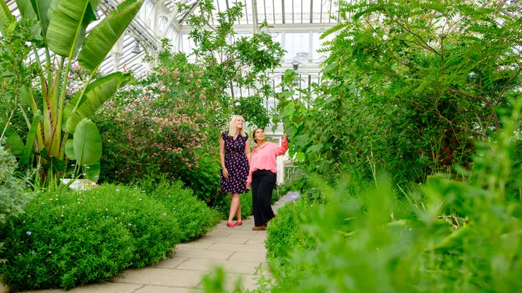
<Card>
  <Image
    src="/images/cards/vale-108-jh.webp"
    alt="Two visitors admiring the plants along a path inside a Vale glasshouse"
    variant="card"
  />
  <CardContent>
    <CardTitle href="https://www.vade.org/read-and-watch/ginkgo-biloba-dig-deeper">Best things to do at Vale this spring</CardTitle>
    <CardDescription>The dinosaur tree that's still with us</CardDescription>
    <CardFooter href="https://www.vade.org/read-and-watch/ginkgo-biloba-dig-deeper">Read more</CardFooter>
  </CardContent>
</Card>
<Card> <Image src="/images/cards/vale-108-jh.webp" alt="Two visitors admiring the plants along a path inside a Vale glasshouse" variant="card" /> <CardContent> <CardTitle href="https://www.vade.org/read-and-watch/ginkgo-biloba-dig-deeper">Best things to do at Vale this spring</CardTitle> <CardDescription>The dinosaur tree that's still with us</CardDescription> <CardFooter href="https://www.vade.org/read-and-watch/ginkgo-biloba-dig-deeper">Read more</CardFooter> </CardContent></Card>
<Card>
<Image
src="/images/cards/vale-108-jh.webp"
alt="Two visitors admiring the plants along a path inside a Vale glasshouse"
variant="card"
/>
<CardContent>
<CardTitle href="https://www.vade.org/read-and-watch/ginkgo-biloba-dig-deeper">Best things to do at Vale this spring</CardTitle>
<CardDescription>The dinosaur tree that's still with us</CardDescription>
<CardFooter href="https://www.vade.org/read-and-watch/ginkgo-biloba-dig-deeper">Read more</CardFooter>
</CardContent>
</Card>
Installation
Copy to clipboard
npx @vds-testing/cli add card
npx @vds-testing/cli add card
npx @vds-testing/cli add card
bunx @vds-testing/cli add card
bunx @vds-testing/cli add card
bunx @vds-testing/cli add card
pnpm dlx @vds-testing/cli add card
pnpm dlx @vds-testing/cli add card
pnpm dlx @vds-testing/cli add card
yarn dlx @vds-testing/cli add card
yarn dlx @vds-testing/cli add card
yarn dlx @vds-testing/cli add card
Usage
import { Card, CardBadge, CardContent, CardDescription, CardFooter, CardTitle,} from "@/components/vds/card"import { Image } from "@/components/vds/image"
By default the card is 370px wide (capped at its container width) with a light gray border stroke drawn inside the edge. The image fills the card width at the card ratio (370 × 208px by default), and the title sits 16px below it. CardContent is white with 20px horizontal padding. Image assets should be exported at 2x the displayed size as WebP.
Examples
Without link
CardFooter is optional. Leave it out when the card doesn’t need a “Read more” link.
<Card>
  <Image src="/images/cards/vale-108-jh.webp" alt="Two visitors admiring the plants along a path inside a Vale glasshouse" variant="card" />
  <CardContent>
    <CardTitle href="https://www.vade.org/read-and-watch/ginkgo-biloba-dig-deeper">Best things to do at Vale this spring</CardTitle>
    <CardDescription>The dinosaur tree that's still with us</CardDescription>
  </CardContent>
</Card>
<Card> <Image src="/images/cards/vale-108-jh.webp" alt="Two visitors admiring the plants along a path inside a Vale glasshouse" variant="card" /> <CardContent> <CardTitle href="https://www.vade.org/read-and-watch/ginkgo-biloba-dig-deeper">Best things to do at Vale this spring</CardTitle> <CardDescription>The dinosaur tree that's still with us</CardDescription> </CardContent></Card>
<Card>
<Image src="/images/cards/vale-108-jh.webp" alt="Two visitors admiring the plants along a path inside a Vale glasshouse" variant="card" />
<CardContent>
<CardTitle href="https://www.vade.org/read-and-watch/ginkgo-biloba-dig-deeper">Best things to do at Vale this spring</CardTitle>
<CardDescription>The dinosaur tree that's still with us</CardDescription>
</CardContent>
</Card>
With badge
Place CardBadge between Image and CardContent to overlay a Badge on the image. It sits flush in the top-right corner of the card by default. position="bottom-left" pins it flush to the bottom-left corner of the image.
<div class="flex flex-wrap gap-6">
  <Card>
    <Image src="/images/cards/vale-108-jh.webp" alt="Two visitors admiring the plants along a path inside a Vale glasshouse" variant="card" />
    <CardBadge variant="teal">New</CardBadge>
    <CardContent>
      <CardTitle href="https://www.vade.org/read-and-watch/ginkgo-biloba-dig-deeper">Best things to do at Vale this spring</CardTitle>
      <CardDescription>The dinosaur tree that's still with us</CardDescription>
      <CardFooter href="https://www.vade.org/read-and-watch/ginkgo-biloba-dig-deeper">Read more</CardFooter>
    </CardContent>
  </Card>
  <Card>
    <Image src="/images/cards/vale-108-jh.webp" alt="Two visitors admiring the plants along a path inside a Vale glasshouse" variant="card" />
    <CardBadge variant="yellow" position="bottom-left" textCase="title">Members only</CardBadge>
    <CardContent>
      <CardTitle href="https://www.vade.org/read-and-watch/ginkgo-biloba-dig-deeper">Best things to do at Vale this spring</CardTitle>
      <CardDescription>The dinosaur tree that's still with us</CardDescription>
      <CardFooter href="https://www.vade.org/read-and-watch/ginkgo-biloba-dig-deeper">Read more</CardFooter>
    </CardContent>
  </Card>
</div>
<div class="flex flex-wrap gap-6"> <Card> <Image src="/images/cards/vale-108-jh.webp" alt="Two visitors admiring the plants along a path inside a Vale glasshouse" variant="card" /> <CardBadge variant="teal">New</CardBadge> <CardContent> <CardTitle href="https://www.vade.org/read-and-watch/ginkgo-biloba-dig-deeper">Best things to do at Vale this spring</CardTitle> <CardDescription>The dinosaur tree that's still with us</CardDescription> <CardFooter href="https://www.vade.org/read-and-watch/ginkgo-biloba-dig-deeper">Read more</CardFooter> </CardContent> </Card> <Card> <Image src="/images/cards/vale-108-jh.webp" alt="Two visitors admiring the plants along a path inside a Vale glasshouse" variant="card" /> <CardBadge variant="yellow" position="bottom-left" textCase="title">Members only</CardBadge> <CardContent> <CardTitle href="https://www.vade.org/read-and-watch/ginkgo-biloba-dig-deeper">Best things to do at Vale this spring</CardTitle> <CardDescription>The dinosaur tree that's still with us</CardDescription> <CardFooter href="https://www.vade.org/read-and-watch/ginkgo-biloba-dig-deeper">Read more</CardFooter> </CardContent> </Card></div>
<div class="flex flex-wrap gap-6">
<Card>
<Image src="/images/cards/vale-108-jh.webp" alt="Two visitors admiring the plants along a path inside a Vale glasshouse" variant="card" />
<CardBadge variant="teal">New</CardBadge>
<CardContent>
<CardTitle href="https://www.vade.org/read-and-watch/ginkgo-biloba-dig-deeper">Best things to do at Vale this spring</CardTitle>
<CardDescription>The dinosaur tree that's still with us</CardDescription>
<CardFooter href="https://www.vade.org/read-and-watch/ginkgo-biloba-dig-deeper">Read more</CardFooter>
</CardContent>
</Card>
<Card>
<Image src="/images/cards/vale-108-jh.webp" alt="Two visitors admiring the plants along a path inside a Vale glasshouse" variant="card" />
<CardBadge variant="yellow" position="bottom-left" textCase="title">Members only</CardBadge>
<CardContent>
<CardTitle href="https://www.vade.org/read-and-watch/ginkgo-biloba-dig-deeper">Best things to do at Vale this spring</CardTitle>
<CardDescription>The dinosaur tree that's still with us</CardDescription>
<CardFooter href="https://www.vade.org/read-and-watch/ginkgo-biloba-dig-deeper">Read more</CardFooter>
</CardContent>
</Card>
</div>
Custom width and image ratio
Set the card width with a width class, and change the image shape with the ratio prop on Image. The image always fills the card width.
<Card class="w-[280px]">
  <Image src="/images/cards/vale-108-jh.webp" alt="Two visitors admiring the plants along a path inside a Vale glasshouse" variant="card" ratio="4/3" />
  <CardContent>
    <CardTitle href="https://www.vade.org/read-and-watch/ginkgo-biloba-dig-deeper">Best things to do at Vale this spring</CardTitle>
    <CardDescription>The dinosaur tree that's still with us</CardDescription>
    <CardFooter href="https://www.vade.org/read-and-watch/ginkgo-biloba-dig-deeper">Read more</CardFooter>
  </CardContent>
</Card>
<Card class="w-[280px]"> <Image src="/images/cards/vale-108-jh.webp" alt="Two visitors admiring the plants along a path inside a Vale glasshouse" variant="card" ratio="4/3" /> <CardContent> <CardTitle href="https://www.vade.org/read-and-watch/ginkgo-biloba-dig-deeper">Best things to do at Vale this spring</CardTitle> <CardDescription>The dinosaur tree that's still with us</CardDescription> <CardFooter href="https://www.vade.org/read-and-watch/ginkgo-biloba-dig-deeper">Read more</CardFooter> </CardContent></Card>
<Card class="w-[280px]">
<Image src="/images/cards/vale-108-jh.webp" alt="Two visitors admiring the plants along a path inside a Vale glasshouse" variant="card" ratio="4/3" />
<CardContent>
<CardTitle href="https://www.vade.org/read-and-watch/ginkgo-biloba-dig-deeper">Best things to do at Vale this spring</CardTitle>
<CardDescription>The dinosaur tree that's still with us</CardDescription>
<CardFooter href="https://www.vade.org/read-and-watch/ginkgo-biloba-dig-deeper">Read more</CardFooter>
</CardContent>
</Card>
Props
Card
Prop
Type
Default
Description
class
string
-
Additional CSS classes. Pass a width class (e.g. w-[280px]) to override the default 370px width
CardTitle
Prop
Type
Default
Description
href
string
-
Makes the title a link with the VDS focus-text focus state
class
string
-
Additional CSS classes
CardDescription, CardContent
Prop
Type
Default
Description
class
string
-
Additional CSS classes
CardFooter
Prop
Type
Default
Description
href
string
-
Link destination
disabled
boolean
false
Marks the link as disabled
class
string
-
Additional CSS classes
CardBadge
Prop
Type
Default
Description
position
“top-right” | “bottom-left”
“top-right”
Corner of the image the badge is pinned to, with no inset